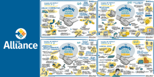
The Alliance is introducing a fresh, new visual identity this fall, building upon strengths it has developed since its inception 14 years ago, following the Organ Donation National Breakthrough Collaboratives. The new logo began to roll out recently.
“The time was appropriate to take stock in our external message,” shared Karri Hobson-Pape, Executive Director of The Alliance. “This year shocked the system for all of us. However, in spite of this unprecedented crisis, our community has continued to support donors and care for patients in need. It is now more critical than ever to navigate this new frontier together, as a unified front. We felt it was important to convey this through our visual identity.”
The brand refresh showcases a bold new take on the prior logo and emphasizes three core tenets of the organization:
- Serving the 3 Estates of Donation and Transplantation: Represented by the three distinct color icons in the circle, the visual identity emphasizes our commitment to convening hospitals where donations occur, organ procurement organizations and transplant centers & programs. We are proud to be a collaborative platform that serves ALL. In addition, if you look closely, three letters provide upward “hooks,” symbolically lifting the broader group, with a forward-facing direction.
- Advancement: Forward progress by sharing emerging (and effective) practices is core to the mission of The Alliance. Through relevant, targeted, scalable learning programs, we are advancing the discipline and supporting the community of practice. The arrow pointing forward represents not only The Alliance but the many other supportive associations and government agencies dedicated to saving and healing lives.
- Commitment to Service: The Alliance team is committed to excellent service to meet the needs of a diverse and dedicated group of professionals across the country. The combination of figures in the logo convey The Alliance’s personality attributes – collaborative, resolute, passionate and partner-driven. A welcoming tone was intentional through the typeface and color development.
Corey Bryant, Director of Communications, led the effort. “The refreshed colors are bolder in tone, conveying that we face challenges in healthcare with a strong, collaborative approach. While the tone may be slightly different, we clearly build upon the successes of the past and the influential people who brought The Alliance to this point,” Bryant said.
While the logo has already begun to emerge on select communications vehicles, it will take several months to convert all of the assets associated with The Alliance. In late 2020, The Alliance will launch a new website with the refreshed brand identity. The dedicated communications team will work diligently to make the complete transition as quickly as possible, targeting end of year for a full rollout.
For more information on The Alliance visual identity, where you can download our logo files and brand guidelines, visit https://www.organdonationalliance.org/about/branding/.